Single Logo Approach
One file, a few color variants. Unreadable at small sizes, lost on dark backgrounds, cramped on mobile. Result: every application requires an improvised workaround.
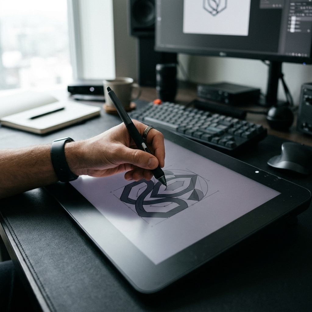
Logo Design is the most frequently encountered visual signature of your business, distilling your brand's story and strategic identity into a single symbol. A good logo must maintain its functionality at every scale, background, and form. At Monolith Works, we take logo design beyond an aesthetic drawing. We deliver this symbol, which sets you apart from competitors, as a complete system together with usage rules, variants, and vector resources.
01
A logo does not have to be beautiful; it has to be recognisable, memorable, and useful to the brand.
— MONOLITH WORKS
Logo design is one of the most visible yet least understood disciplines of branding. Most businesses see the logo as a 'visual tag'; in reality the logo is the brand strategy distilled into a single symbol. The sector you operate in, the audience you serve, the value you stand for: all of these should be readable in the logo's lines.
In the design process we clarify the strategy first, then move into form. This order matters because if a logo starts from form it cannot go beyond an aesthetic preference; if it starts from strategy it becomes an asset that serves the brand's future.
02
A good logo is not a single file; it is a full system. Primary logo, symbol/monogram, horizontal and vertical variations, single-color and negative uses, minimum size rules, safe-area definitions. When all these pieces come together your logo works correctly in every environment from digital advertising to industrial etching.
One file, a few color variants. Unreadable at small sizes, lost on dark backgrounds, cramped on mobile. Result: every application requires an improvised workaround.
Primary logo, symbol, monogram, horizontal/vertical/responsive variations, single-color and engraved-application optimized versions. Which version for which use is documented with rules.
03
We clarify what the logo should represent before drawing a single line. Aesthetics serve the strategy, not the other way around.
A logo's job is to be remembered and identified. We prioritize clarity and distinctiveness over decoration.
From a favicon to a building sign, the logo has to hold up. We design and test it across the full range of real uses.
We deliver vector and raster source files in every needed format. Your logo belongs to you; you are never locked to one designer.
Every project includes up to 2 revision rounds; we agree on their scope at the start, so expectations stay clear for both sides.
A mini usage guide ships with the logo, so anyone in your company applies it correctly without guesswork.
04
Sector, target audience, brand personality, and competitive positioning. Before moving to logo form we clarify what it should represent.
Multiple concept directions, hand and digital sketch work. We evaluate together which direction best reflects the brand strategy.
Golden ratio, optical balance, visual weight. Every angle and curve in the logo is placed for a mathematical reason; nothing is left to chance.
Primary color palette, single-color black/white versions, variations optimised for dark and light backgrounds. Every usage scenario prepared in advance.
Readability at every size from web favicon to highway sign. We produce simplified 'responsive' logo forms for small sizes.
Vector (AI, SVG, PDF), raster (PNG, JPG, WEBP), and print-friendly (EPS, CMYK) formats. A logo usage guide (mini brandbook) is included in the package.
05
"We didn't even have the source file of our old logo, and every place had a different version. Now we have ready files for every scenario, clear rules, and a mini usage guide. The hunt for a designer is over."
06
A logo design project takes 2 weeks on average. The process starts with a strategic brief and research, followed by concept presentations and feedback rounds. Up to 2 revision rounds are included in the process. Since a logo will be the most frequently seen visual element of your brand for years, it is a stage that shouldn't be rushed; if you want to shorten the duration, the time you dedicate to the briefing stage is decisive.
After the strategic brief is complete we present 2-3 different concept directions. Each concept is a different visual approach to the same strategy; we then refine and iterate on the preferred direction. Monolith Works olarak süreci şeffaf sprint adımları, veri odaklı analizler ve net kilometre taşlarıyla yönetiyoruz. Böylece markanız hem arama motorlarında hem de yapay zeka cevap motorlarında sürdürülebilir görünürlük ve yüksek dönüşüm performansı elde eder.
We deliver vector (AI, SVG, PDF), raster (PNG, JPG, WEBP, TIFF), and print (EPS, CMYK) formats. All color variations, horizontal/vertical uses, and responsive versions are packaged in separate folders. This allows you to use the logo on your website, social media, print, or signage without having to request additional file preparation.
Yes. The logo package includes a mini usage guide (logo brandbook): minimum sizes, safe area, color combinations, restrictions, and correct usage examples. Monolith Works olarak süreci şeffaf sprint adımları, veri odaklı analizler ve net kilometre taşlarıyla yönetiyoruz. Böylece markanız hem arama motorlarında hem de yapay zeka cevap motorlarında sürdürülebilir görünürlük ve yüksek dönüşüm performansı elde eder.
Yes. If your existing logo has built emotional equity but has aged visually, we offer a refresh: the form is preserved while proportions and typography are modernised. Faster and less risky than a full redesign. Monolith Works olarak süreci şeffaf sprint adımları, veri odaklı analizler ve net kilometre taşlarıyla yönetiyoruz. Böylece markanız hem arama motorlarında hem de yapay zeka cevap motorlarında sürdürülebilir görünürlük ve yüksek dönüşüm performansı elde eder.
We do not file registrations directly but can refer you to trademark lawyers we work with. During design we do preliminary research to ensure no similar logos exist. Monolith Works olarak süreci şeffaf sprint adımları, veri odaklı analizler ve net kilometre taşlarıyla yönetiyoruz. Böylece markanız hem arama motorlarında hem de yapay zeka cevap motorlarında sürdürülebilir görünürlük ve yüksek dönüşüm performansı elde eder.
In a discovery call we evaluate the current state of your logo, your needs, and your goals together. Whether the answer is a new logo from scratch or a refresh, we decide together.