BACK TO ARCHIVE
DESIGN

THE POWER OF NEGATIVE SPACE: ELITE UI/UX

JAN 22, 2026
6 MIN READ

The impact of distraction-free interfaces on user retention and the logic of 'invisible' design.

The Power of Negative Space: Why Less is More?

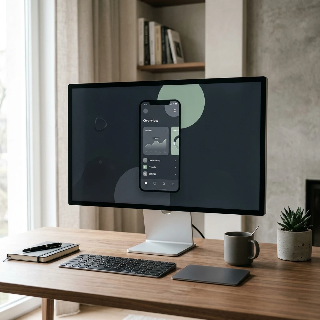
Minimalist UI/UX design is the art of providing the purest experience to the user by eliminating clutter. Adopted by global giants like Apple, Google, and Tesla, this approach is based on the philosophy that "every pixel must have a purpose." At Monolith Works, we design minimalist but powerful interfaces and perfect the user experience.
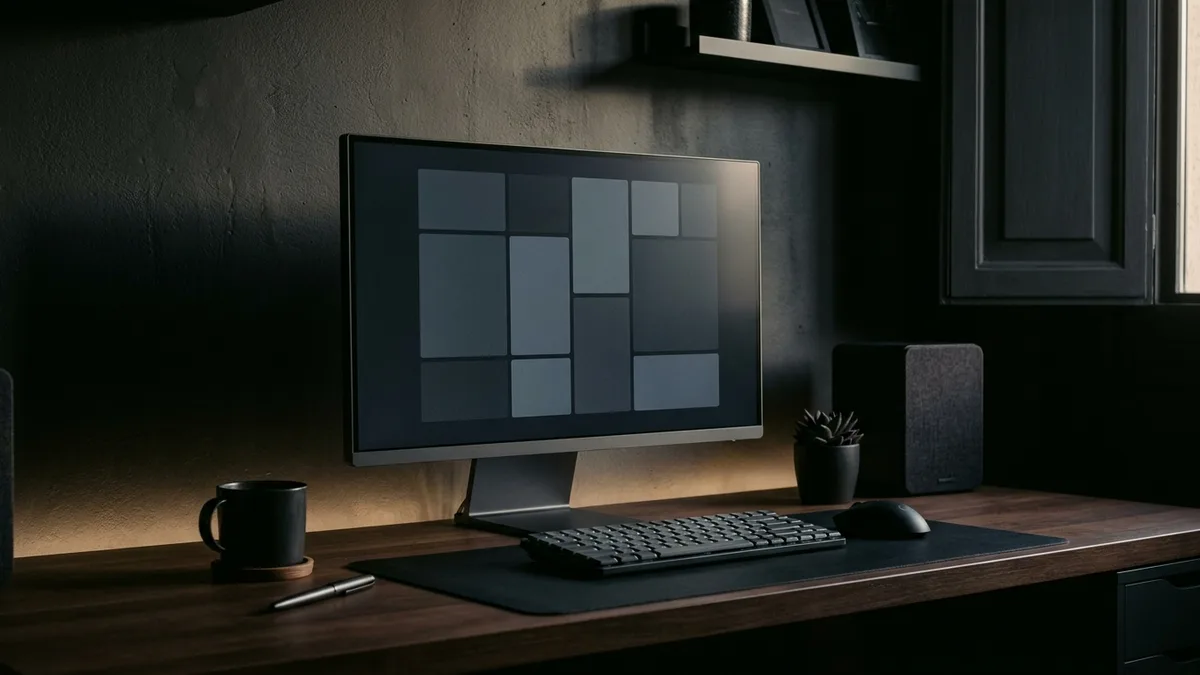
Invisible design: The perfection the user doesn't notice but feels

Core Principles of Minimalist Design

  • Whitespace (Negative Space): Creating visual breathing room by leaving enough space between elements
  • Typography Hierarchy: Creating a clear reading order with 2-3 font families
  • Limited Color Palette: Consistent and strong brand identity with 2-4 main colors
  • Content Priority: Content is always ahead of design
  • Functional Aesthetics: Every visual element must have a function

Impact on Conversion Rate

Research shows that websites with minimalist patterns have up to 35% higher conversion rates. When unnecessary elements that distract the user are removed, CTA (Call to Action) buttons become more effective and the user journey becomes clearer.

Accessibility and Minimalism

Minimalist design also makes it easier to meet accessibility standards. High contrast ratios, clear typography, large clickable areas, and simple navigation structure provide a better experience for both visually impaired and elderly users. Compliance with WCAG AAA standards also positively affects your SEO ranking.

MONOLITH_LOG

Perfection is achieved, not when there is nothing more to add, but when there is nothing left to take away.

Antoine de Saint-Exupéry

Relationship Between Minimalism and Performance

Minimalist design, by its nature, means fewer HTTP requests, smaller file sizes, and cleaner code structure. This directly improves the loading speed of the website. It is much easier to get high scores in Google's Core Web Vitals metrics with a minimalist design philosophy. Fast sites positively affect both user experience and SEO ranking.

Get in touch for minimalist and conversion-oriented design solutions for your website.

GET DESIGN QUOTE

Typography in Minimalist Design: When Less Is More

Minimalist interfaces rely heavily on typography to create hierarchy and rhythm. A disciplined type system — typically two fonts maximum, with consistent size scales and generous line height — does the structural work that ornamental decoration does in richer designs. Variable fonts (which adjust weight and width along continuous axes) enable expressive typographic moments without adding visual noise. The principle: let the text breathe, and readers will naturally follow the content hierarchy.

White Space as an Active Design Element

Amateur designers fill empty space instinctively; expert minimalist designers protect it deliberately. White space (or negative space) is not empty — it is the visual breathing room that gives content weight and focus. Studies show that increasing white space around text blocks improves reading comprehension by up to 20%. Padding generously, widening margins, and resisting the urge to fill every pixel creates premium, confident interfaces that guide attention precisely where intended.

Color Strategy in Minimalist UI

Minimalist color strategy operates on restraint and intentionality. A monochromatic palette with one accent color for interactive elements is a proven formula: the accent color carries all the functional weight (buttons, links, highlights), while the neutral palette handles structure and content. When a minimalist palette does use multiple hues, the contrast ratios must be mathematically precise for WCAG accessibility compliance. This constraint often produces more visually sophisticated results than unconstrained color choices.

Navigation Patterns That Disappear Into the Experience

Minimalist navigation design prioritizes the content, not the chrome. Sticky minimal navigation bars, hamburger menus that expand to full-screen overlays, and progressive disclosure (showing options as they become relevant) keep interfaces uncluttered. Research on eye-tracking confirms that users scan in F and Z patterns — minimalist layouts that align content to these natural reading patterns dramatically reduce cognitive friction and improve task completion rates.

Mobile Minimalism: Performance as a Design Principle

On mobile, minimalism is not just aesthetic — it is performance engineering. Every removed element is a reduction in load time, rendering work, and user attention demands. Mobile minimalist design principles: single-column layouts, tap targets minimum 44x44px, forms with the fewest possible fields, progressive image loading, and content-first prioritization above the fold. Google's Mobile-Friendly Test and Core Web Vitals scores consistently reward minimalist mobile implementations.

Frequently Asked Questions

Can minimalist design work for complex products with many features?+
Yes — progressive disclosure is the key. Show the most common actions prominently, hide advanced features behind secondary navigation. Gmail, Notion, and Figma all manage enormous feature sets within minimalist interfaces by revealing complexity on demand rather than presenting it all at once. The goal is simplicity of experience, not simplicity of underlying capability.
How do I know if my minimalist design is too sparse?+
Test with real users. If task completion rates drop or users report confusion about where to click, the design has crossed from minimal to ambiguous. Key indicator: users should be able to identify the primary action on any page within 3 seconds without reading a single word. If they can't, add strategic visual signifiers — not decoration, but clearer affordances.

Commission a minimalist, high-converting website design from Monolith Works.

REQUEST DESIGN CONSULTATION
SHARE PROTOCOL
LINKEDIN
X / TWITTER
WHATSAPP

Publication Info

AuthorMONOLITH WORKS

Keywords

#UI/UX#MINIMALISM#USER EXPERIENCE#INTERFACE DESIGN#EMPTY SPACE THEORY#ACCESSIBILITY#TYPOGRAPHY#COLOR PSYCHOLOGY#MICRO INTERACTIONS#PROTOTYPING

Professional Support

Need professional help with this topic? The Monolith Works team is by your side.

GET IN TOUCH

THE POWER OF NEGATIVE SPACE: ELITE UI/UX

The impact of distraction-free interfaces on user retention and the logic of 'invisible' design.

The Power of Negative Space: Why Less is More?

Minimalist UI/UX design is the art of providing the purest experience to the user by eliminating clutter. Adopted by global giants like Apple, Google, and Tesla, this approach is based on the philosophy that "every pixel must have a purpose." At Monolith Works, we design minimalist but powerful interfaces and perfect the user experience.

Minimalist UI UX Design Principles

Core Principles of Minimalist Design

  • Whitespace (Negative Space): Creating visual breathing room by leaving enough space between elements
  • Typography Hierarchy: Creating a clear reading order with 2-3 font families
  • Limited Color Palette: Consistent and strong brand identity with 2-4 main colors
  • Content Priority: Content is always ahead of design
  • Functional Aesthetics: Every visual element must have a function

Impact on Conversion Rate

Research shows that websites with minimalist patterns have up to 35% higher conversion rates. When unnecessary elements that distract the user are removed, CTA (Call to Action) buttons become more effective and the user journey becomes clearer.

Accessibility and Minimalism

Minimalist design also makes it easier to meet accessibility standards. High contrast ratios, clear typography, large clickable areas, and simple navigation structure provide a better experience for both visually impaired and elderly users. Compliance with WCAG AAA standards also positively affects your SEO ranking.

Perfection is achieved, not when there is nothing more to add, but when there is nothing left to take away.

Relationship Between Minimalism and Performance

Minimalist design, by its nature, means fewer HTTP requests, smaller file sizes, and cleaner code structure. This directly improves the loading speed of the website. It is much easier to get high scores in Google's Core Web Vitals metrics with a minimalist design philosophy. Fast sites positively affect both user experience and SEO ranking.

Get in touch for minimalist and conversion-oriented design solutions for your website.

Typography in Minimalist Design: When Less Is More

Minimalist interfaces rely heavily on typography to create hierarchy and rhythm. A disciplined type system — typically two fonts maximum, with consistent size scales and generous line height — does the structural work that ornamental decoration does in richer designs. Variable fonts (which adjust weight and width along continuous axes) enable expressive typographic moments without adding visual noise. The principle: let the text breathe, and readers will naturally follow the content hierarchy.

White Space as an Active Design Element

Amateur designers fill empty space instinctively; expert minimalist designers protect it deliberately. White space (or negative space) is not empty — it is the visual breathing room that gives content weight and focus. Studies show that increasing white space around text blocks improves reading comprehension by up to 20%. Padding generously, widening margins, and resisting the urge to fill every pixel creates premium, confident interfaces that guide attention precisely where intended.

Color Strategy in Minimalist UI

Minimalist color strategy operates on restraint and intentionality. A monochromatic palette with one accent color for interactive elements is a proven formula: the accent color carries all the functional weight (buttons, links, highlights), while the neutral palette handles structure and content. When a minimalist palette does use multiple hues, the contrast ratios must be mathematically precise for WCAG accessibility compliance. This constraint often produces more visually sophisticated results than unconstrained color choices.

Navigation Patterns That Disappear Into the Experience

Minimalist navigation design prioritizes the content, not the chrome. Sticky minimal navigation bars, hamburger menus that expand to full-screen overlays, and progressive disclosure (showing options as they become relevant) keep interfaces uncluttered. Research on eye-tracking confirms that users scan in F and Z patterns — minimalist layouts that align content to these natural reading patterns dramatically reduce cognitive friction and improve task completion rates.

Mobile Minimalism: Performance as a Design Principle

On mobile, minimalism is not just aesthetic — it is performance engineering. Every removed element is a reduction in load time, rendering work, and user attention demands. Mobile minimalist design principles: single-column layouts, tap targets minimum 44x44px, forms with the fewest possible fields, progressive image loading, and content-first prioritization above the fold. Google's Mobile-Friendly Test and Core Web Vitals scores consistently reward minimalist mobile implementations.

Can minimalist design work for complex products with many features?

Yes — progressive disclosure is the key. Show the most common actions prominently, hide advanced features behind secondary navigation. Gmail, Notion, and Figma all manage enormous feature sets within minimalist interfaces by revealing complexity on demand rather than presenting it all at once. The goal is simplicity of experience, not simplicity of underlying capability.

How do I know if my minimalist design is too sparse?

Test with real users. If task completion rates drop or users report confusion about where to click, the design has crossed from minimal to ambiguous. Key indicator: users should be able to identify the primary action on any page within 3 seconds without reading a single word. If they can't, add strategic visual signifiers — not decoration, but clearer affordances.

Commission a minimalist, high-converting website design from Monolith Works.