SOLACE
The seamless brand identity of medical authority and pure luxury.
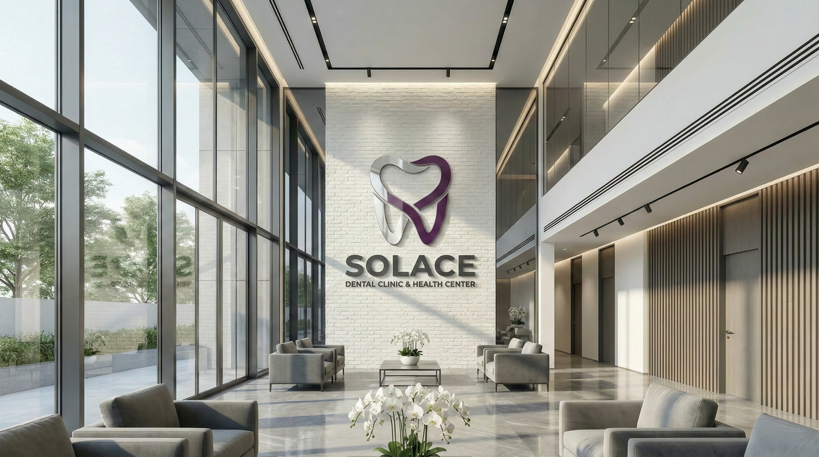
With the Solace project, we transformed a clinical environment into a brand experience. Aiming for the highest standards of health tourism, we designed materials symbolizing absolute hygiene, serenity-focused spatial guidance, and an elite patient journey.
"Health is our most seamless luxury."
99.2%
FULL
FAST
AB
TENOR SANS / INTER
SOLACE: THE ADDRESS OF PURE LUXURY IN HEALTH
ABCDEFGHIJKLMNOPQRSTUVWXYZ abcdefghijklmnopqrstuvwxyz 1234567890
STYLES
USAGE
DIGITAL IDENTITY
MYSTIC PURPLE
#4C1D95
MEDICAL DEPTH.
SUDEN WHITE
#F3F4F6
ABSOLUTE PURIFICATION.
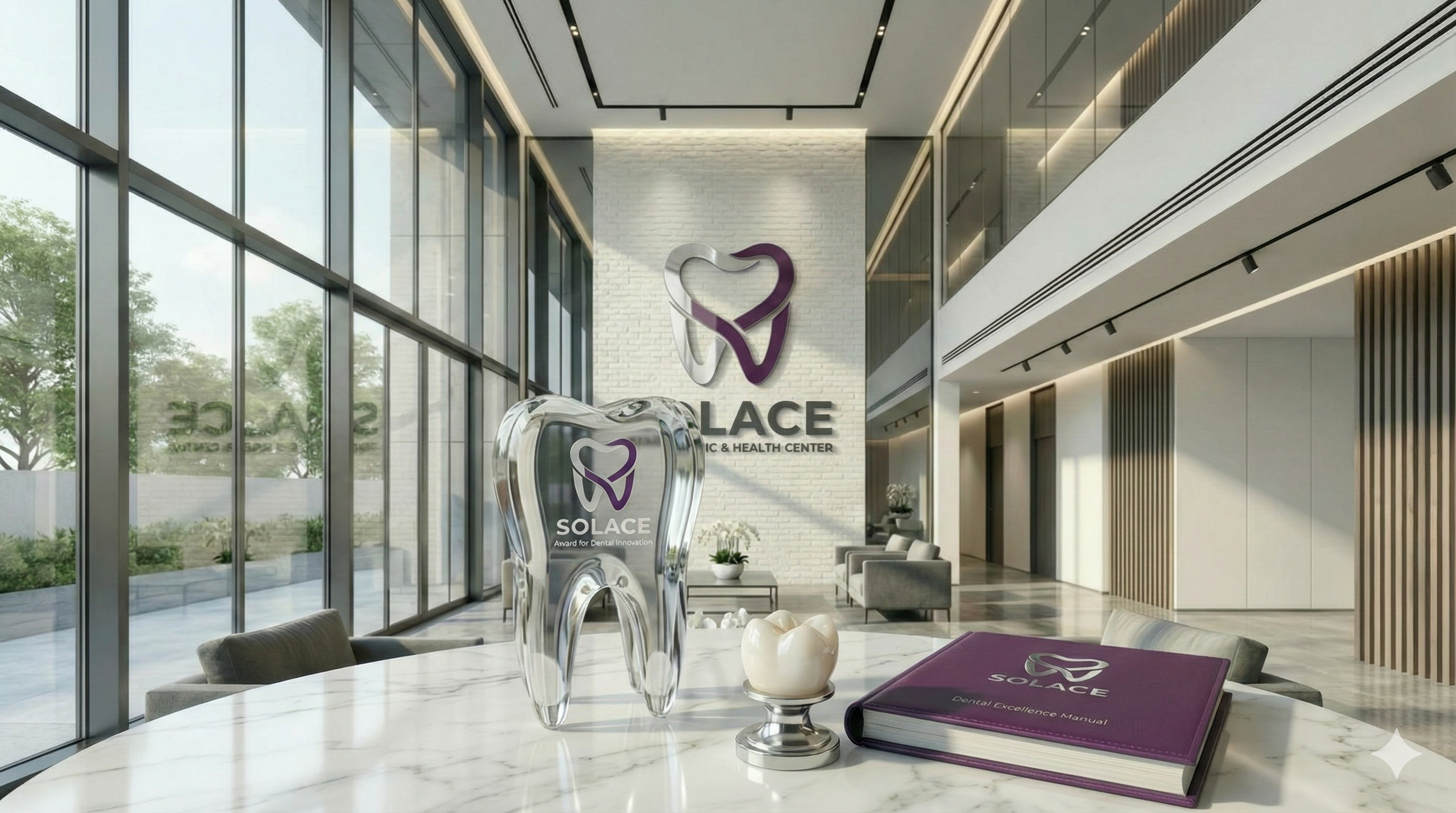
LOGO DESIGN AND STORY
Conceptual construction of the medical logo instilling feelings of purification, VIP sterility, and trust into the patient's mind at the first point of contact.
VISUAL ANALYSIS & INTERPRETATION
The logo design story visualizes the craft phase where rational forms meet aesthetics and symbolic layers of meaning.
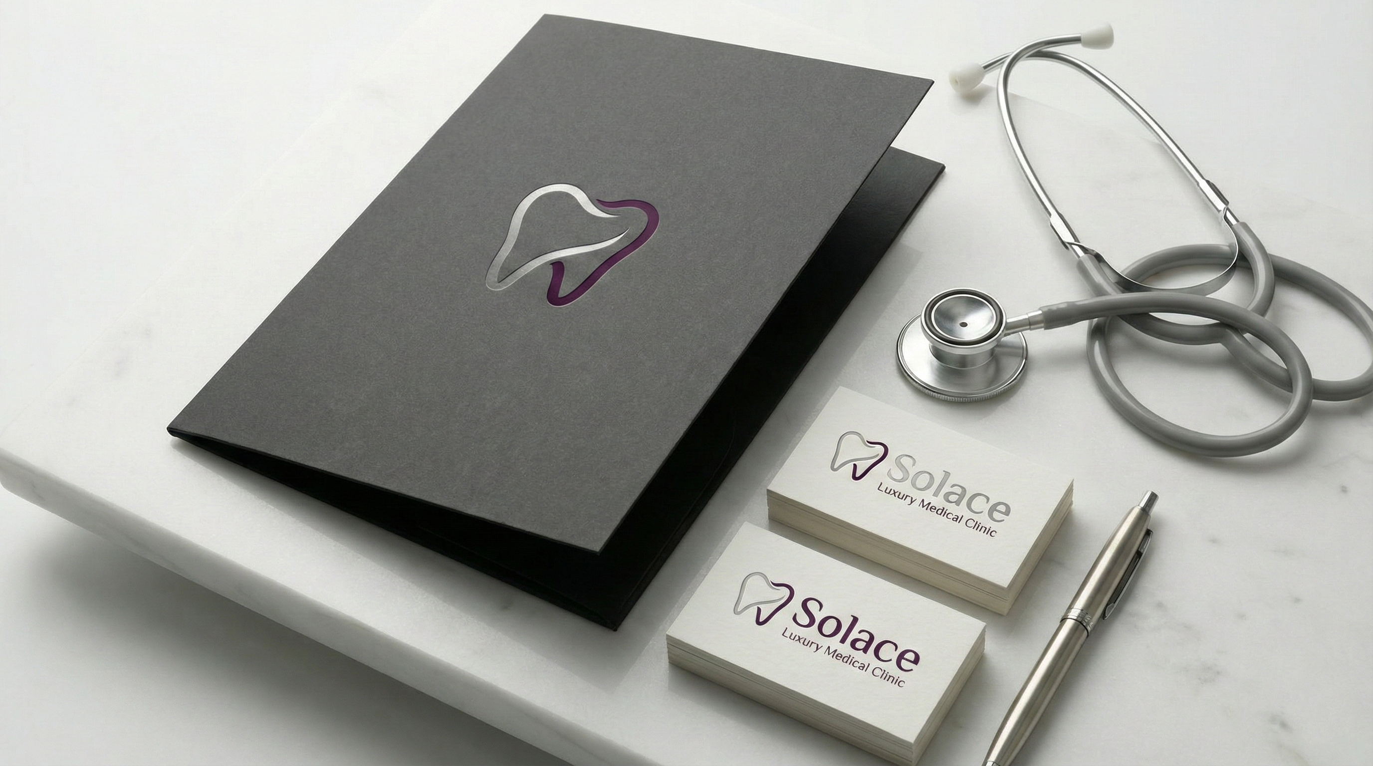
CORPORATE IDENTITY DESIGN
A prestigious corporate flow where every single material, from clinic forms to luxury patient welcome kits, is designed with the comfort of a hotel.
VISUAL ANALYSIS & INTERPRETATION
Corporate identity domination; the seamless visual language and trust-building consistency established across all physical and digital touchpoints.
IMPACT & RESULTS FOCUS
The investment brand value created by premium medical quality in the clinic and the permanent power of luxury healthcare in the global corporate vision.
VISUAL ANALYSIS & INTERPRETATION
Intra-company impact and results; the tangible real-world value of the design, brand prestige, and the lasting psychological imprint on the user.